
Colors have a profound impact on our emotions, moods, and even productivity levels. Whether you want to create a relaxing bedroom, an energizing kitchen, or a sophisticated living space, choosing the right colors can transform the ambiance of your home. Let’s dive into the psychology behind colors and how to use them effectively in each room.
🌈 Understanding the Power of Colors
Colors do more than just beautify a space—they influence how we feel and interact within it. Here’s a quick breakdown of how different colors affect us:
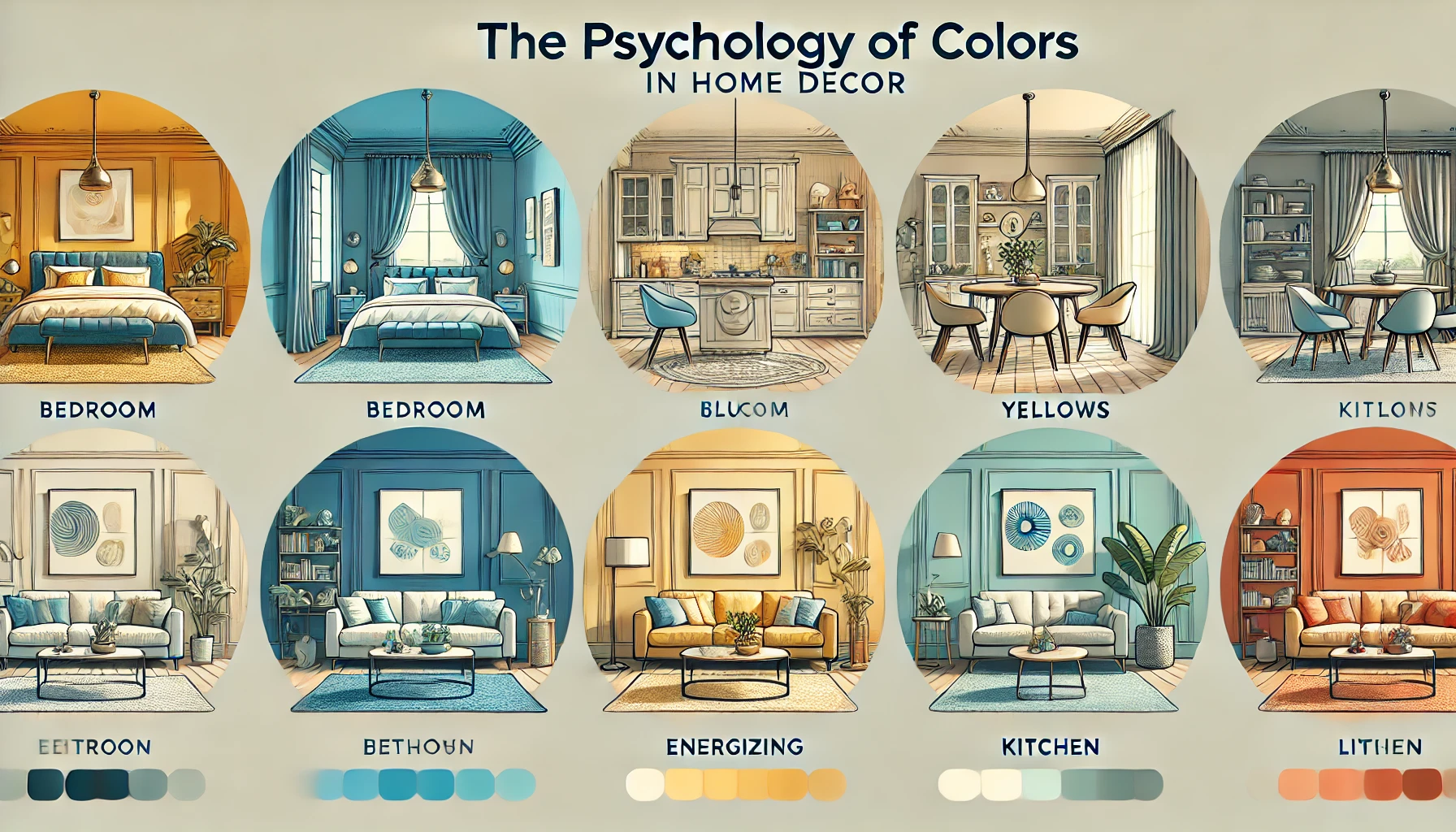
🔹 Blue – Calming and Serene: Promotes relaxation, lowers stress levels, and enhances focus. Ideal for bedrooms and home offices.
🔹 Yellow – Energizing and Cheerful: Encourages positivity and creativity. Perfect for kitchens and dining areas.
🔹 Green – Balanced and Refreshing: Represents nature and tranquility, great for living rooms and bathrooms.
🔹 Red – Passionate and Stimulating: Creates excitement and warmth, best used in moderation in dining areas or accents.
🔹 Gray – Sophisticated and Neutral: Adds elegance and versatility to any space, often used in living rooms or offices.
🔹 White – Clean and Minimal: Evokes a sense of openness and cleanliness, suitable for small spaces.
🔹 Purple – Luxurious and Creative: Associated with royalty and imagination, perfect for bedrooms and creative spaces.
🏠 Choosing Colors for Each Room
1. Bedroom Colors for Relaxation 😴
Your bedroom should be a sanctuary of rest and peace. Soft blues, muted greens, and gentle lavenders create a calming effect that promotes sleep and relaxation. If you prefer warm tones, opt for light beige or taupe for a cozy feel.
Tips:
- Use pastel shades to avoid overpowering the space.
- Add white or neutral bedding to balance out bold colors.
- Incorporate accent colors through pillows or artwork.
2. Living Room Colors for Comfort 🛋️
The living room is where you entertain guests and unwind, so it’s important to strike a balance between comfort and style. Earthy tones like warm grays, soft greens, or deep blues can create an inviting atmosphere.
Tips:
- Pair neutral walls with bold furniture for a modern look.
- Use contrasting colors in décor elements like throw pillows or rugs.
- Consider a feature wall in a statement color for added personality.
3. Kitchen Colors for Energy 🍽️
Kitchens thrive on energy and warmth, making colors like yellow, red, and even bright white excellent choices. Yellow enhances appetite and brings a cheerful vibe, while red stimulates conversation.
Tips:
- Use bold colors in moderation to avoid overwhelming the space.
- Combine bright tones with neutral countertops and cabinets.
- Add pops of color through kitchen accessories.
4. Home Office Colors for Productivity 💻
To enhance concentration and creativity, opt for colors like soft blues, greens, or light grays. These colors can help reduce distractions and improve focus, making them perfect for a workspace.
Tips:
- Avoid overly dark colors to maintain a bright and focused atmosphere.
- Use a white or light-colored desk to keep the space feeling open.
- Incorporate plants to complement the color palette.
5. Bathroom Colors for Refreshment 🚿
Bathrooms should evoke cleanliness and freshness. Crisp whites, cool blues, and gentle greens help create a spa-like experience, making your bathroom feel serene and inviting.
Tips:
- Use tiles in different shades to add depth to the space.
- Consider adding wood elements for warmth and balance.
- Keep accessories minimal for a clean, uncluttered look.
6. Dining Room Colors for Warmth 🍷
Warm tones like deep reds, oranges, or rich browns can create an intimate dining experience, encouraging conversation and appetite. If you prefer a modern look, opt for dark greens or charcoal gray.
Tips:
- Combine with wooden furniture for a rustic feel.
- Add dimmable lighting to adjust the mood of the space.
- Experiment with textured wallpapers to add character.
🎯 Tips for Selecting the Perfect Color Palette
- Consider Natural Light: Rooms with plenty of natural light can handle darker shades, while smaller spaces benefit from lighter colors.
- Test Before Committing: Use sample swatches to see how colors look under different lighting conditions.
- Stick to a Theme: Choose a cohesive palette that flows throughout your home for a harmonious look.
- Balance Bold and Neutral: Use bold colors sparingly and balance them with neutrals to avoid overwhelming the space.
🌿 Final Thoughts
Choosing the right colors for your home is an exciting process that can completely transform how you feel and function within your space. Whether you’re aiming for relaxation, energy, or sophistication, understanding color psychology can help you make informed choices that reflect your personality and lifestyle. 🎨🏡